Introduction
Kitchen design in 2025 is evolving toward harmony between natural elegance and minimalism. As homeowners and developers seek warm, grounded aesthetics, color plays a crucial role in defining the kitchen’s personality. From earth tones to bold contrasts, here’s a look at the cabinet colors leading the way this year.
1. The Overall Color Direction in 2025
1、Natural and calming: Earthy greens, beiges, and light browns bring a grounded feel
2、Matte neutrals: Cream, taupe, and soft white dominate modern minimal interiors
3、Bold contrasts: Black, graphite, and navy blue make a statement in contemporary spaces
4、Warm, inviting tones: Terracotta, blush, and clay are growing in popularity
2025 is all about comfort, texture, and emotional connection.
2. Trending Kitchen Cabinet Colors for 2025
1、Sage Green & Dusty Olive
A go-to for nature-inspired kitchens. This tone balances warmth with calm and works beautifully with wooden accents and stone countertops.
2、Warm Taupe & Light Mushroom
Elegant and timeless, these neutrals replace cold greys. They feel cozy, luxurious, and pair well with brass hardware.
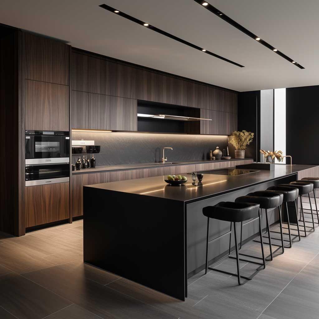
3、Matte Black & Graphite
Perfect for urban and luxury kitchens. These dark hues add depth and sophistication, especially with high-end finishes like matte lacquer.
4、Blush Pink & Terracotta
Softer, warmer tones are returning, especially in modern, creative interiors. Pair with cream for a romantic look or charcoal for bold contrast.
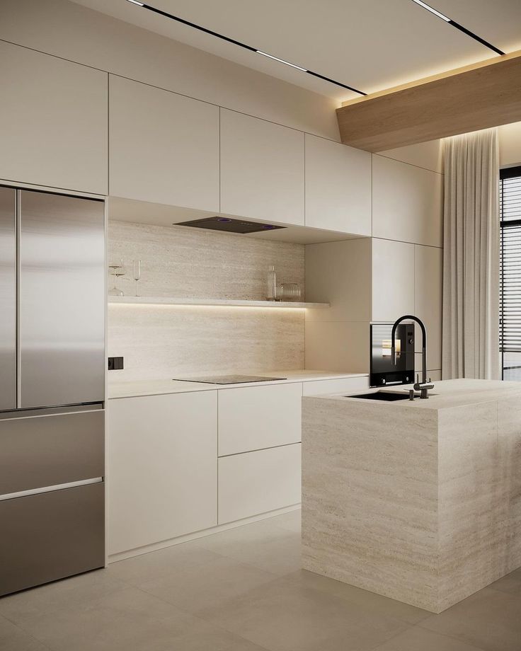
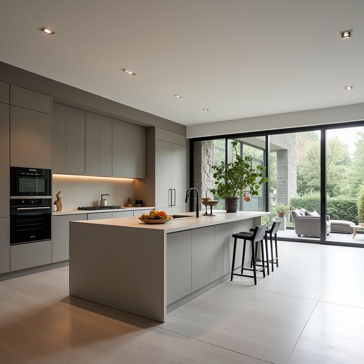
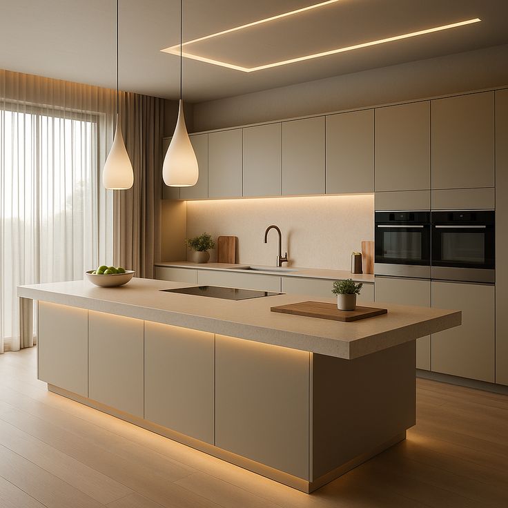
5、Classic White & Cloudy Beige
Still popular for Scandinavian and minimalist designs, especially when combined with warm wood tones.
3. Finish Matters: Color + Texture
| Color Category | Recommended Finish | Effect |
|---|
| Earth tones | Matte lacquer, wood veneer | Natural, tactile, calming |
| Dark modern colors | Anti-fingerprint matte PET | Sleek, high-end, clean |
| Soft pastels | UV lacquer, acrylic | Vibrant, smooth, bright |
| Neutrals | Super matte, grain texture | Warm, elegant |
A finish can completely transform how a color is perceived in real space.
4. Color Pairing Suggestions (Expanded)
1、Sage Green + Natural Oak — Biophilic harmony
1、Look & mood: Calm, airy, nature-inspired; pairs well with plants and soft textiles.
2、Finishes: Super-matte AF sage (laminate or lacquer); rift-cut natural oak veneer for tall units/shelves; ABS edges 1–2 mm, zero-joint near sinks.
3、Hardware: Brushed nickel or satin brass; consider slim edge pulls.
4、Tops & splash: Warm-white quartz with subtle veins; off-white/zellige splash.
5、Lighting: 3000–3500 K under-cabinet + warm brass pendants.
6、Pro tip: Keep oak tone neutral (avoid yellow cast). Run vertical grain on tall doors to elongate the space.
2、Taupe + Brushed Brass — Understated luxury
1、Look & mood: Quiet hotel-level elegance; warm without glare.
2、Finishes: Taupe super-matte or satin; tight reveals and shadow lines for a tailored feel.
3、Hardware: Brushed brass pulls/channels (less fingerprint than polished).
4、Tops & splash: Crema or warm-Calacatta quartz; full-height slab splash for minimal seams.
5、Lighting: Warm-dim pendants (2700–3000 K) + toe-kick glow for a floating effect.
6、Pro tip: Add soft weave bar stools or linen shades to layer texture.
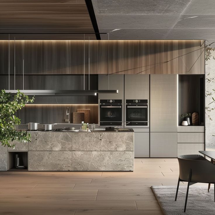
3、Graphite + White Marble — High-contrast elegance
1、Look & mood: Crisp, modern drama with gallery vibes.
2、Finishes: Graphite matte HPL; zero-joint edging; dark carcass interior.
3、Hardware: Matte-black T-bars or integrated J-pull.
4、Tops & splash: White marble or marble-look porcelain; 20 mm mitred edge; stainless behind the hob.
5、Lighting: 3500–4000 K task lighting; anti-glare trims to control contrast.
6、Pro tip: Break up the dark massing with ribbed/clear-glass uppers or open shelves.
4、Terracotta + Matte Black Handles — Artistic statement
1、Look & mood: Earthy Mediterranean with contemporary bite.
2、Finishes: Terracotta micro-texture matte (laminate/lacquer) that hides prints.
3、Hardware: Matte black bars/rails; black tap and accessories.
4、Tops & splash: Concrete-look quartz; lime-wash or patterned tile niche for artistry.
5、Lighting: Black track with adjustable spots; 3000 K.
6、Pro tip: Balance warmth with pale floors (light oak/limestone) and off-white walls to keep it fresh.
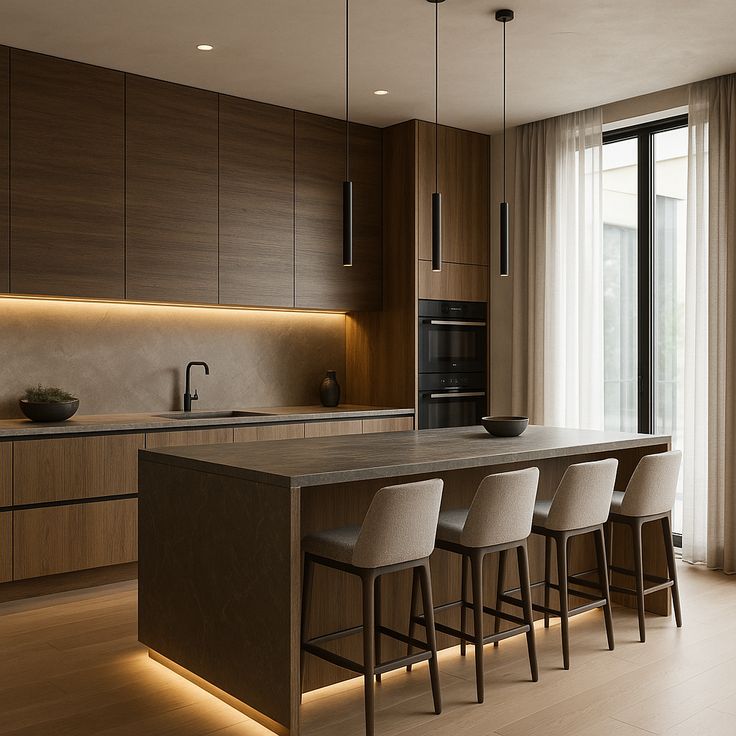
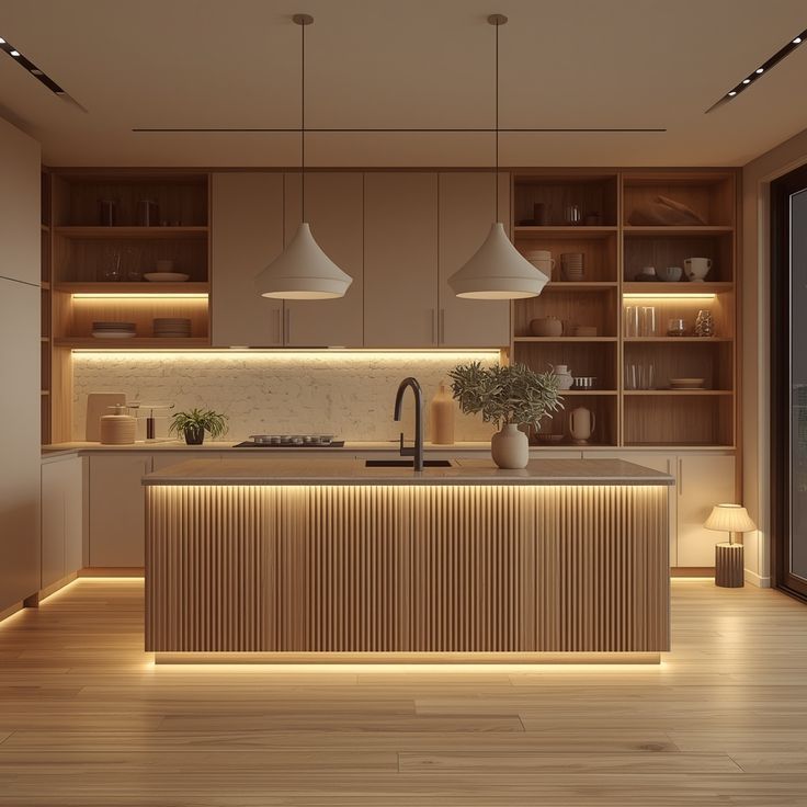
5、Cloudy Beige + Walnut Veneer — Timeless warmth
1、Look & mood: Classic, upscale, family-friendly.
2、Finishes: Cloudy-beige super-matte on perimeter; walnut veneer island/tall units (synchronized pore if available).
3、Hardware: Satin nickel or aged bronze cup pulls/linear bars.
4、Tops & splash: Honed white or light-taupe quartz; handmade or herringbone tile.
5、Lighting: Layered—under-cabinet task, perimeter downlights, linen-shade pendants (3000–3500 K).
Pro tip: Keep walnut to 30–40% of façades for balance; specify grain continuity around the island.
5. AIS Kitchen Color Solutions
At AIS, we turn color into a project asset—balancing trend appeal, durability, and roll-out efficiency for single homes and large developments alike.
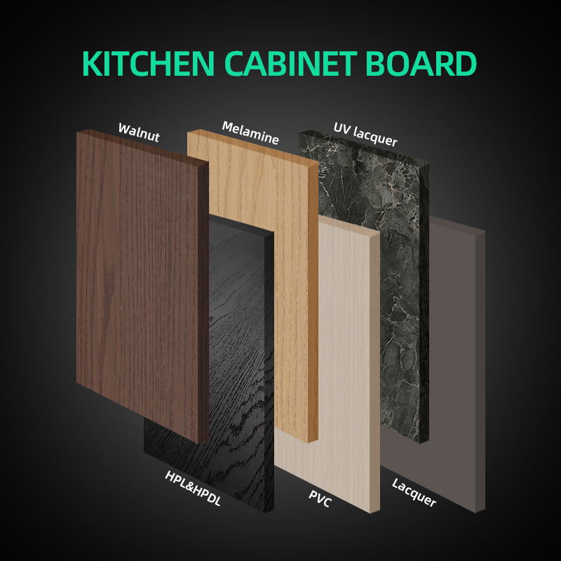
1、Finish Library (60+ on-trend options)
1、PET Foil (matte/gloss): Crisp, color-true, great for light palettes and high-gloss looks; budget-friendly with clean edges.
2、UV (UV-cured lacquer): Smooth, consistent sheen with enhanced scratch resistance for everyday use.
3、Lacquer (spray painted MDF): Rich color depth and custom tones (matte/satin/gloss); ideal for premium schemes and radius details.
4、Acrylic (super-gloss): Mirror-like reflectance for compact kitchens needing visual enlargement.
5、Veneer (oak/walnut/teak looks): Natural warmth and grain options (rift/quarter/straight), book-matched or sequenced upon request.
6、Spec notes: Color-matched ABS 1–2 mm edging; zero-joint edges near moisture/heat zones; carcass in HMR board where needed.
2、Fingerprint-Free Matte (AF) Surfaces
1、Look & feel: Soft, low-gloss elegance with reduced prints and micro-swirls—camera-ready for show units.
2、Where it shines: Family homes, rentals, hospitality back-of-house, and large projects requiring easy maintenance.
3、Care: Mild detergent + microfiber; avoid abrasives/harsh solvents.
3、Project-Based Color Matching (Process & Deliverables)
1、Brief intake: Target buyer profile, daylight, flooring, countertop options, and brand mood.
2、Sampling: A4 finish boards under site-like lighting (3000–4000 K); provide 2–3 curated palettes.
3、Mock-up: One full-size door/drawer front with specified edge and handle finish.
4、Documentation: Room-by-room Color & Finish Schedule (codes, sheen, grain direction), hardware finish pairing, and installation notes for heat/steam areas.
5、Value engineering: Parallel palette with similar aesthetics but lower cost/lead time for scale projects.
4、Smart Palette Suggestions by Project Type
1、Luxury apartments: Forest/emerald matte + brass, or satin lacquer neutrals with stone-vein splash; statement island finish.
2、Compact kitchens & studios: Pale PET gloss or AF light gray for bounce; slim hardware; bright task lighting.
3、Rental/PRS portfolios: HPL/UV matte mid-tones + woodgrain accents; robust edges; easy-clean specs.
4、Coastal/high-humidity: HPL fronts, HMR carcasses, sealed cut edges; avoid steam vents at door edges.
5、Hospitality/serviced apartments: Dark veneers on public faces; HPL in service zones; unified hardware finishes across floors.
6、Developer bulk: Two base palettes (Light/Medium) + optional Accent Pack (island or appliance bank) for differentiation without re-engineering.
5、Implementation & Spec Checklist (Copy into your RFQ)
1、Edge: ABS 1–2 mm; zero-joint required at sink/dishwasher/oven sides
2、Core: MDF for doors; HMR PB for carcasses in wet-adjacent zones
3、Grain direction: vertical for tall doors, horizontal for islands (note on drawings)
4、Hardware finish: satin brass / matte black / chrome (specify series & SKUs)
5、Lighting: 3000–3500 K under-cabinet; driver access noted
6、Samples: A4 boards + one full-size mock-up door prior to sign-off
Conclusion
Kitchen cabinet colors in 2026 go beyond aesthetics—they influence spatial perception, user comfort, and long-term project value. This year’s palettes emphasize warmth, natural balance, and design longevity, making them ideal for residential developments, premium apartments, and large-scale kitchen upgrades. With AIS’s advanced color systems and customized cabinet solutions, developers and homeowners can achieve kitchens that are both on-trend for 2026 and enduring for years to come.